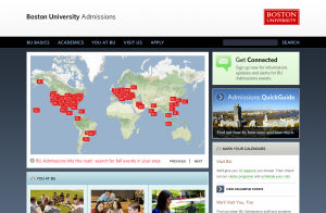
Many students were surprised to come back to campus this September and find large, lit up, red pillar-like figures pointing out campus destinations. The purpose of these incredibly high-budgeted pillars replacing the equally high-budgeted gold leaf signs that still adorn some of the buildings?
The classic case of re-branding.
As with any change to any brand, there are two sides: the cheerleaders and the naysayers. The cheerleaders are all for the change. Boston University, in particular, has had an extremely “old-school,” conservative look to it for a very long time. As with any other product or service category, this look has to change with the times, so it only makes sense for BU to get with the times and change.
“What exactly does taking the line between Boston and University do?” said Jennifer Crandall (CFA ’11).
Students like Crandall have been questioning this change since its inception two years ago. The University took out the horizontal line in the logo and made all official letterheads, e-mail signatures, and correspondence fonts a modern and clean sans serif, as opposed to its traditional and older-looking serif predecessor.
The reasoning behind all of these changes?
According to the BU Branding website, to “express a single, compelling voice” in all University endeavors.
Prospective freshman and junior in a New York State public high school Daniel said of his impression of BU, “When I visited, I didn’t feel like I was at school. Kind of like NYU.”
Whether or not this is a good thing remains to be seen. Many prospective students, like Daniel, rule out BU as a potential college because of the lack of campus.
“The campus is what gives a school its atmosphere,” Daniel concludes. “At BU, everything looks different. I wouldn’t even know that I was at a school since there weren’t any big signs when I was there.”

Daniel’s words are true. Boston University is a diverse campus in every aspect: academics, student population, student groups, and…architecture. The buildings across campus all look different. No two buildings, besides the residences on Bay State and in South campus, look too similar. It is easy to differentiate, say, the College of Communication (COM) and the School of Hospitality (SHA). Besides the gold leaf signs that people could barely see from afar, there was no real unity throughout the entirety of the Charles River Campus.
That is, until the Marketing & Communications (another addition to the branding was that the ampersand be used instead of the word “and”) came onto the scene.
After all was said and done—new logo, new stationary, new website—every employee was given a Branding Handbook so that everyone could represent the University in the same way. The Branding website gives students and faculty and staff members guidelines on how to use the logo, how to use the colors, and a copy of the logo for everyone to download.
Unfortunately, we were unable to speak with members of the Marketing & Communications department at BU due to scheduling conflicts; however, the BU Branding website also states that the “totality of the logo, visuals, and words we use…will enable us to establish and maintain a clear, unified brand identity, both within the University community and beyond.”
Despite all valiant efforts, though,students and prospective students aren’t getting the message.
“I get that they want the University to look more like a University,” said Robert Sesek (COM ’11), “It makes sense. But sometimes I’ll call the one office and they’ll transfer me to another office, and when I get on the phone with someone, they’ll be like, ‘oh we don’t do that.’ Don’t the departments talk to each other?”

So the logo and the physical look of the University aren’t the only things that represent the BU brand. The employees’ knowledge-base, their consistency in messages sent to the BU community and beyond, and the service offered throughout the University all lend to brand image. It holds true for any other product or service category. BU isn’t any different.
“The signs are kind of obtrusive and ugly.” Crandall said, “It’s also just a waste of our tuition money. I already saw one by west campus broken by some drunk kid. It’s probably going to cost a lot to fix.”
And perhaps the ambiguity of the campus drew more attention than the University thought. Many students expressed how “cool” it was to have to be a student at BU to understand what all our acronyms and short-hand sayings meant. It’s like “being a part of a secret club,” according to an anonymous College of Arts & Sciences (CAS) senior.
On the other hand, unity makes the University seem more like a single entity, rather than CAS, COM, SMG, CFA, SHA, the list goes on.
“I think it’s a good idea.” Daniel says of the new branding, “It might help bring a community together and make people feel like they belong to something. I want to go to college to be a part of something and if these signs help bring all the students together, it just makes BU more appealing to me.”
With a compelling argument for the change in the branding like that, how is BU to deny its prospective students—the ones who really count—what it wants? But is simply looking like a unified University make the student population more unified?
Studies done on college campuses of all different sizes, locations, and areas of study show that students who choose to go to an urban campus, like BU and NYU and UCLA, tend to be more independent and less school-spirited. We chose to come to this school over another because we all wanted to be in an urban area—or at least didn’t mind being in an urban area. With so many non-University-sponsored activities to do, at student discounted prices, it’s hard to convince students to go to the basketball game or attend a local band’s concert in BU Central.
It has nothing to do with things the University is doing wrong. It’s just the nature of the beast, as they say. Students who choose to go to urban schools tend to be disinterested in school-related activities. And then the social stigma comes in. Unless you’re involved in Greek Life, going to a hockey game, or a nerd, you don’t go to events on campus and that feeling seems to be the consensus of the student population.
True, it takes awhile for people to get used to change, and there will always be someone—or multiple someones—who are vehemently against a change in branding.
Think Pepsi. But it worked for Pepsi.
Tropicana on the other hand? They had to retreat back to their classic old logo after several months of…well, going unnoticed. Because they changed.
The same goes for Universities, BU included. The risk was taken. And now we just have to see if we’re the Pepsi or the Tropicana of brand changes.

I like this article. As a club sports athlete, I don’t like how we can no longer get any apparel or gear without using the logo properly. Part of BU Athletics’ policy is that we don’t have any other designs or graphics on our team apparel or gear. We’re only allowed to print on white, red, or gray and then we can only print in black, white, or red. I wish that we could have some more graphics and designs because it sets us apart on the proverbial playing field when other universities have creative apparel and gear that still uses their university’s logo properly. Also, the BU Athletics logos are quite masculine.