Webpages are frames. The frame determines how the content is displayed and experienced. Classical pages have a rigid heirarchy and organization. Newer pages are usually streams, framing their content into a bottomless list of information. This approach works well when the main feature is a perpetually updated list of information. Consider Facebook and Twitter to be the original examples of this presentation, then look at how Upworthy adopted it for a story-driven context. Consider, as well, the way individual items are presented in streams: Twitter refers to its content as cards; Facebook’s News Feed and new Paper app both use cards, with Paper taking the metaphor very literally; and Upworthy’s new design also organizes its content into individually segmented cards. But why use cards as the webpage’s frame-inside-a-frame, and why are they suddenly so popular?
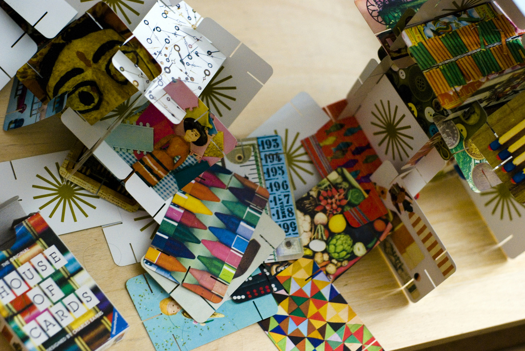
Cards work so well in web design for two reasons. First, cards are the easiest implementation of mobile-first design principles. They are scale-invariant, so they’ll display the same on tiny screens or huge ones. It’s the number of cards that depends on screen size. This is the argument Google used for the card-based design of Google Now. Second, cards easily integrate into social media interfaces, like the ones referenced above. Finally, cards present focused, modular functionality that appeals to both the founding principles of the Web and to modern design aesthetics. Frank Chimero, in describing his own webpage, pulled his inspiration from the Eames House, which was, “everything [he] wanted: modern, but lived in, made out of everyday, accessible materials,” but, “unfortunately, pictures of architecture don’t do much to suggest graphic treatments for a website.” Instead, he draws inspiration from another Eames’s design, their House of Cards:
The cards are interchangeable; they can connect with one another to create larger structures, while each embodying their own visual theme or idea. Sound familiar? Lots of little things coalescing into a bigger, stable, interesting thingie. It’s the web!
Aside from the benefits of being mobile and share-ready, Chimero identifies the core strength of card interfaces: they unify the style and substance of a webpage and its contents. Cards visually express the cooperation of HTML and CSS to structure and style content, all in a way that works across a maximal number of devices and sharing methods.
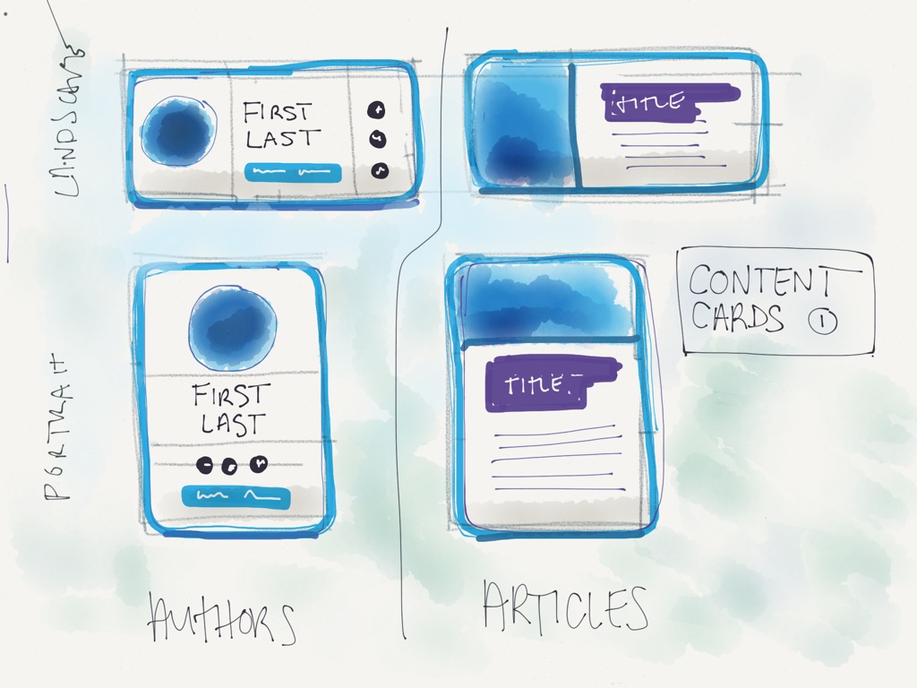
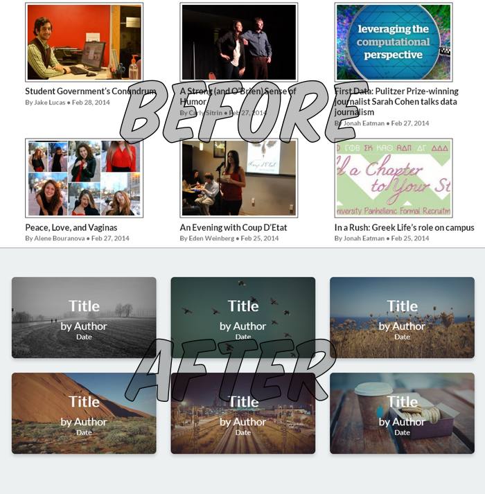
With the framing device decided, I began to mockup three different approaches to using cards in a blog/magazine format. The first are small, tile-like cards for when the most information has to be displayed onscreen. The second are larger, and more recognizable as cards. I think that the tile cards work better on desktop, while the more complete cards work better on mobile. The rational here is that on phones, it’s better to display more information per-card, so that time and data are not wasted while exploring a website. On broadband-connected desktop, exploration is much easier and cheaper. A more visual, rather than textual, browsing experience works better on desktop than mobile. But, these conclusions can be debated, and the markup makes sure that change comes easy. Check out the HTML and see that both types contain the same information, but different styling.
I’ve made a demo, so check it out (on your computer and phone) and let me know what you think. I’ve even spiced it up with a tiny bit of animation, to reinforce the card metaphor. This design is modular, portable, and mobile-ready. It’s a good first step towards redesigning The Quad.